
And now, the next section, and this time, we're going to start sorting a few things...
1. Pavilion Exterior and Interior
c. Floorplan
I had a variety of different sources of material in regards to figuring out where certain attraction components would go - first up, there used to be a small directions map in regards to where an attraction would usually be, as seen below: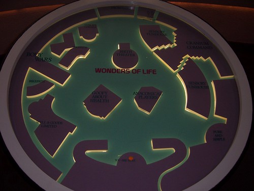 |
| The reference map once present at the head entrance of the pavilion. |
For some reason, given that everything is not to scale in regards to comparing the axtual interior architecture with what's on this map, it appeared that there is only one little problem to be had - given that this pavilion was only one floor, it pretty much crowded up the atmosphere. Of course, if it were possible to give the Wonders of Life pavilion an expansion job, I was thinking in particular that the pavilion be expanded one floor downwards. A little similar to how the Land was put together.
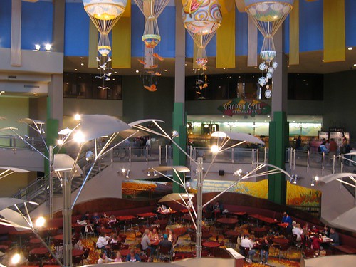
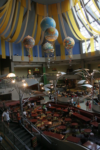
...what you'll notice is that every single building is getting in the way of which attraction you would really want to go to, plus not to mention which ones would catch your eye first.
- "Mom, where's the Body Wars ride?"So two floors are better than one, because first up, it would be spacious and desirable aesthetically - rather than bustling and busy on the one floor in earlier years. Secondly, guests from the first floor can glance at the secondary attractions down below and have a look... in this way, no attraction would go missed. Nothing would be blocking the view from eye level as you're walking around, searching for what to do first. The only disadvantage however, you'd probably have to keep walking around for the right attractions (so a few rest benched be providedat certain points of tha pavilion), but at least you'd be able to burn off the calories of the turkey leg from lunch.
- "Don't worry, Timmy. It's just behind the 'where babies come from' theater!"
Anyhow, assuming that a selection of attractions are retained for the development, and that the excavation effort be possible, and that if it were possible to rearrange the minor exhibits to different locations, here's a first-try idea on how the floorplan might look like at a glance...
 |
| The first attempt at the two-floor floorplan, along with an early idea for additional or rearranged attractions. Click on the image to zoom in and have a look around. comments or concerns greatly accepted |
Of course, it's important to keep in mind that his is only a computerized first draft of the floorplans, with a few additions to the pavilion exhibits... a body systems exhibit filling in the niche for Frontiers in Medicine, a sprint track and physical ability tests in the Fitness Fairgrounds exhibit, and even some spaces for other external exhibits.
d. Grouping and Categorising
As I have put together the floorplan as you might have noticed at the end of the previous section, you may have noticed that it appears scattered all over the place. In regards to themeing and categorizing of parts of the pavilion, it's a little difficult to summarize life as it is. Sure, the pavilion covered a few components - our body systems and their interactions, as well as how to keep it in good shape.| Innerspace Section | Informative Section | Exploratory Section |
|
|
|
In some cases, assuming we're standing at the entrance of the pavilion, we could have the Innerspace section flat out forwards (let's leave the previous attractions as they are), and in the lower floor, you could find the Exploratory and Informative exhibits edging the east half of the pavilion. Facilities (snack bar, souvenirs booth and information booths) could fit in the west half. And that's just what's in my head for the moment. Surely, there's no right or wrong answer on how to arrange the attractions in the right way, but it'll take a lot of thinking and discussing until finally getting the layout right.
So if you have any concerns or enquiries, feel free to say something in the comments section... uhm... yeah, below. Because I'd like some critique or suggestions and what you would like to see in the floorplan. Or if you've thought of something similar that you would like to show me, give a shout.
No comments:
Post a Comment
Commenting is a very helpful method for the following reasons - to provide any information or thoughts on the subject, as well as critiquing or making suggestions. Please note that all comments are moderated, so please plan carefully. Also, if you enjoyed the article, feel free to share it with your friends!