It's in the thread titled What to replace WoL with? and you can find the entire post from this link here. So, let's get down to some explanation, and we'll start by breaking it down into bite sized morsels. Let's go!
1. Pavilion Exterior and Interior
a. Design Elements
To be fair, we might keep the dome structure as the main building for the pavilion. In my view, it's taken a licking for being used for nothing but a festival center. So let's assume we're going to bring it back from the dead. But we'll have to do a few design alterations.First, we'll have to consider a much better colour scheme. Consider this: the pavilion was designed as according to what worked in the early 90's. Bright hot colours, confetti shapes and neons. Not to mention the pavilion dressed up with a carnival theme.
*headdesk*
Let's be timely honest here. These design elements worked back then, but if we were to bring back the pavilion to Future World, the result would be quite lame. Of course, the pavilion design for the 21st century might deserve a new look and feel. Perhaps the use of abstract elements (curves, waves, etc) could work? Some examples of the kind of artwork that would decorate the interior:
from 123RF, for royalty free stock photos.
They may sound like nothing much, but come to think of it, this kind of artwork would reinforce the theme for a life-science pavilion. In fact, this kind of artwork definitely illustrates the theme of biotechnology, much better than confetti. Some might say that these abstract curves might bear a representative resemblance to blood vessels and nerves, if once can imagine that far. Just imagine these beautiful curves dressing up an otherwise drab queue to, say, Body Wars, as shown below......and now for the photojobs I have put together to show how I think it might look like, if the artistic direction gets the green light...
|
See what I'm onto here? I'm sure whoever supports the idea would definitely approve of a design change for the pavilion to fit in line with the 21st century. Colour scheme, perhaps, would be dependent on the location, so for example, for an inner-body thrill ride, it's shades of red; for a hands-on sports exhibit, it's shades of orange or green; for biotechnology, it's shades of blue and teal... so on.
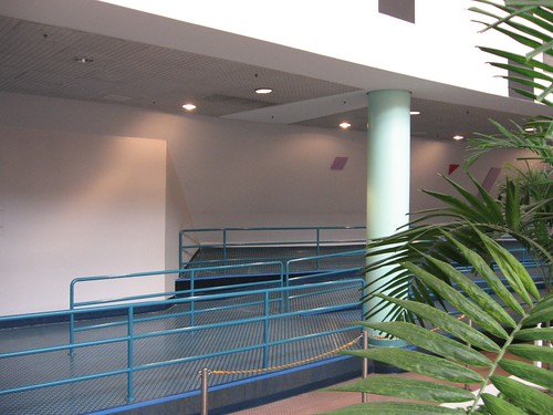
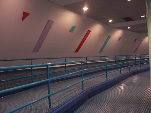
On the subject, you may be familiar with the pavilion's theming as a 'carnival to celebrate life'. Again, not thinking too long term, and if you look at it in Future World, it's a case of sticking out like a sore thumb. Consider these two photos for evidence below:
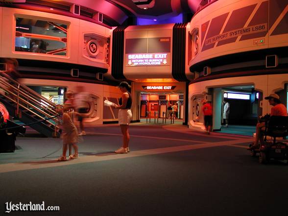
And while it's nice to look back at those wonderful scenes as they were in the pavilion's prime, there are times when you have to snap out of daydreaming in the context of bringing the pav back to the 21st century. A potential suggestion would be to make the pav feel like a futuristic laboratory complex; think of an architectural throwback to The Living Seas, for instance. Have a look for instance:
Which reveals a potential advantage for the pavilion, which would be to expand it lower, and give it a basement level. But that would prove tricky and costly; after all, we might have to gut out the spare basement and even the three theaters in the middle of the pavilion to make that possible. But as we'll get through different portions of the potential reimagineering brief, there'll be some explaining to do.
Readers, if you have any enquiries on this part of the re-imagineering project (UNOFFICIAL, to emphasise), please feel free to leave comments to this blog post (anonymous comments accepted)... or if you have a WDWMAGIC forum account, send me a private message.
NOTE: This blog entry subject to change once all sketches and photo-jobs are put together.


No comments:
Post a Comment
Commenting is a very helpful method for the following reasons - to provide any information or thoughts on the subject, as well as critiquing or making suggestions. Please note that all comments are moderated, so please plan carefully. Also, if you enjoyed the article, feel free to share it with your friends!