Wow, look at the activity at this blog!!! As we continue on with our walkthrough of ways to improve and ressurect the pavilion to a new generation, here's a list of what you may have missed last update:
1. Pavilion Exterior and Interior
e. Colour Schemes
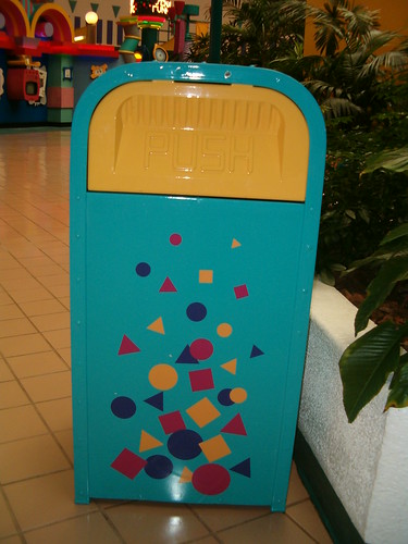
In regards to bringing back the pavilion back from the dead, one thing we must consider is that if we were to bring back the pavilion from the dead in its exact state, it would fail faster than any fail-oriented website... miserably. Probably because of the ambience. Earlier in this segment of the Imagineering section of this blog, I have covered the potential update to the music playlist that I would picture to be played in the pavilion. In this issue of the segment, I'll be covering the colour and design schemes for this pavilion.Now consider this, way back in 1989 near the brink of the 1990's, bright colours and fluorescents were attractive due to the fashions from throughout the 80's decade. All those bright colours that marked the 1980's were strongly used in the pavilion, and probably where it started from was an Olympics bid from 1984, for Los Angeles. Note the confetti and bright colours below:
 |
| The Los Angeles '84 brightly coloured test poster for the Olympics bid, as found in GINORMUS blog. Click to find out more |

...and come to think of it, not even Push the Trashcan was safe.
This was also a potential downside to the pavilion in its ability to keep up with the future in Future World. The design elements heavily rooted the pavilion into the 80s, and hence its popularity plummeted... the graphics (no offence) had become nothing more than an eyesore, in regards to the public. So in pictorial comparisons, here's the colour schemes for the pavilion as they were in the past, and compare it to what could have been if the pav were still here today...
Of course, pictures speak louder than words, and I'm sure some of you guys will get the idea of what I'm getting at right here... it took a lot of thinking and consideration of the design elements that could work for bringing the Wonders of Life pavilion to a new generation, and as you'd see from the bottom rectangle with six potential colour choices, I believe that the design elements would be it... for the following reasons. One of which, obviously, are the inclusion of curves that would symbolise anything organic, and also would pay homage to the DNA double helix that once stood outside the pavilion entrance, once upon a time.
While words for me cannot describe this choice of design for parts of the pavilion, what I could say is that the curves-and-glowing-orbs design could make for a potential greeting mural on entrance of the pavilion, and also parts of the interior where need be. Of course, it's best to use the design wisely, rather than overload it with the same bright colours that the Wonders past once was smothered with. count that, smothered. And that's worst case scenario on repeat.
But on the bright side, remember the photojobs for the Body Wars (or equivalent) queue that I showed you earlier? Here they are, just to show you what I might be onto...
 |
 |
 |
So now that I'm done with this part of the section, it's time that I allow you guys to comment on what you think. Again, comments section, below. You can't miss it. Hope to hear from you guys! ;3


Just want to say I've enjoyed all of your posts about how to bring WOL back and make it work for the 21st century. I seriously hope WDW turns it back into an attraction, instead of just throwing in the towel and permanently keeping it as an out-of-place festival center. I love the design you've come up with, though, frankly, I hope Stitch stays far away from everything. Things did not need character tie-ins before and they still don't if everything is done right.
ReplyDeleteInstead of several small attractions, why not retrofit the building to house one much larger attraction, with the other exhibits supporting it? Why not turn Body Wars into the world's first fully-immersive roller-coaster-through-the-body experience? Something like Revenge of the Mummy at Universal? Give it a similar story, add more elements similar to Dinosaur, but include the thrill to help gain more traffic to the park and alleviate the other big rides. There's so much potential if WDI could marry the ideas from the past to the technology of today.